Hardy's Wessex: The Landscapes that Inspired a Writer
Branding
// Brief
The brief for Wessex Museums titled “Hardy’s Wessex: The Landscapes that Inspired a Writer” is a project to re-brand and gentrify the already established exhibition. Through the exploration of Hardy’s life, the places he visited and worked, and themes expressed in his work.
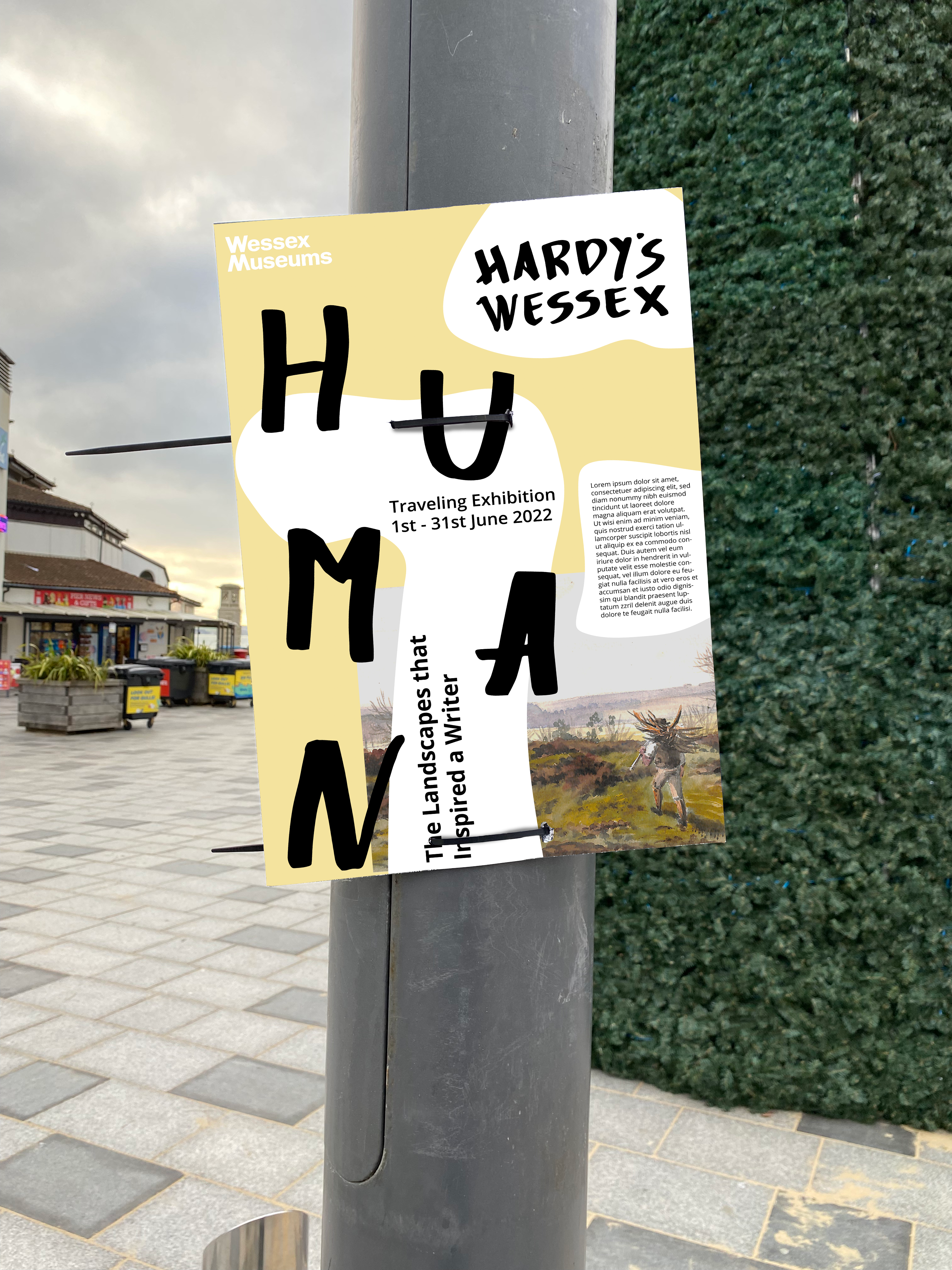
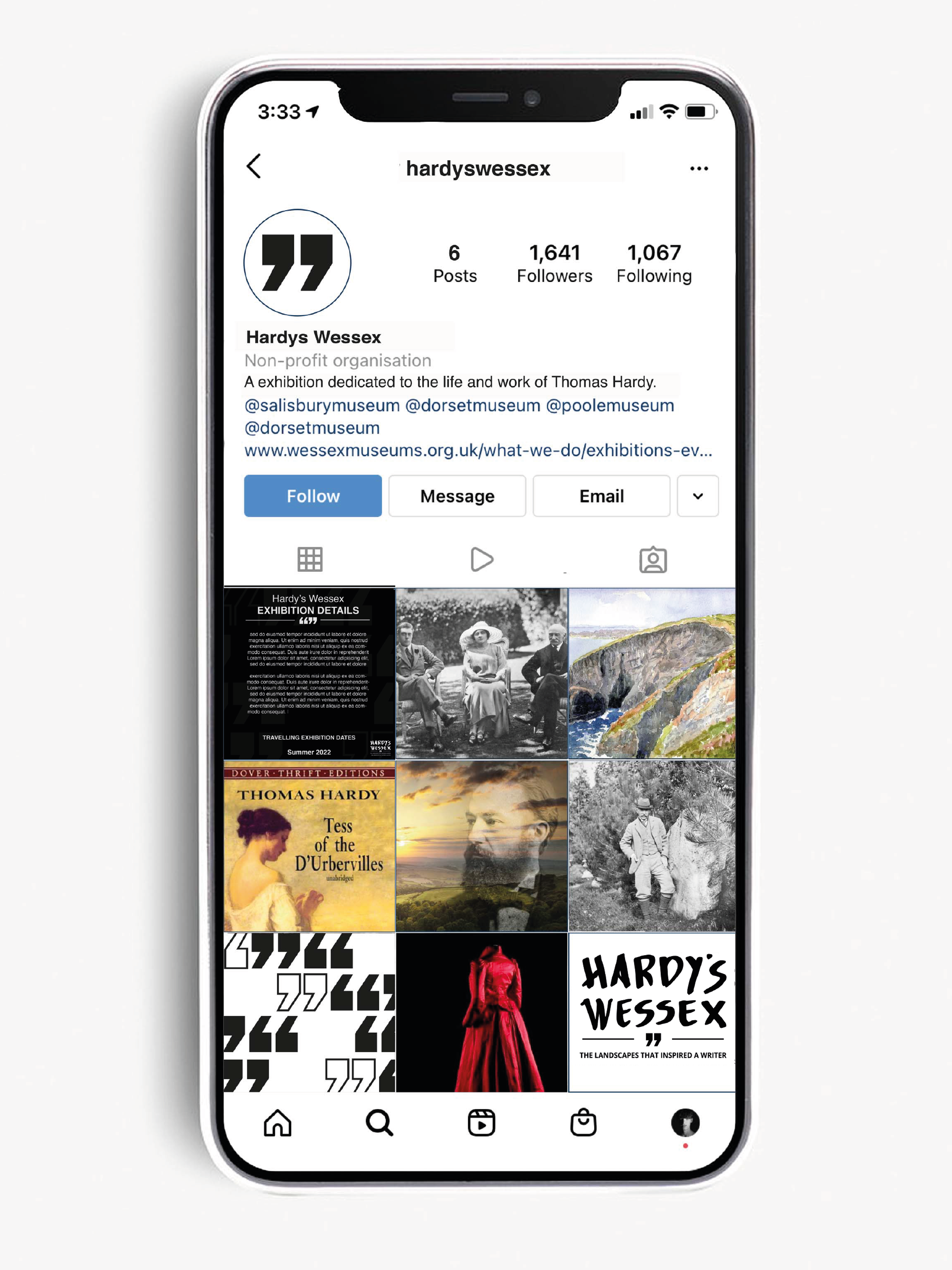
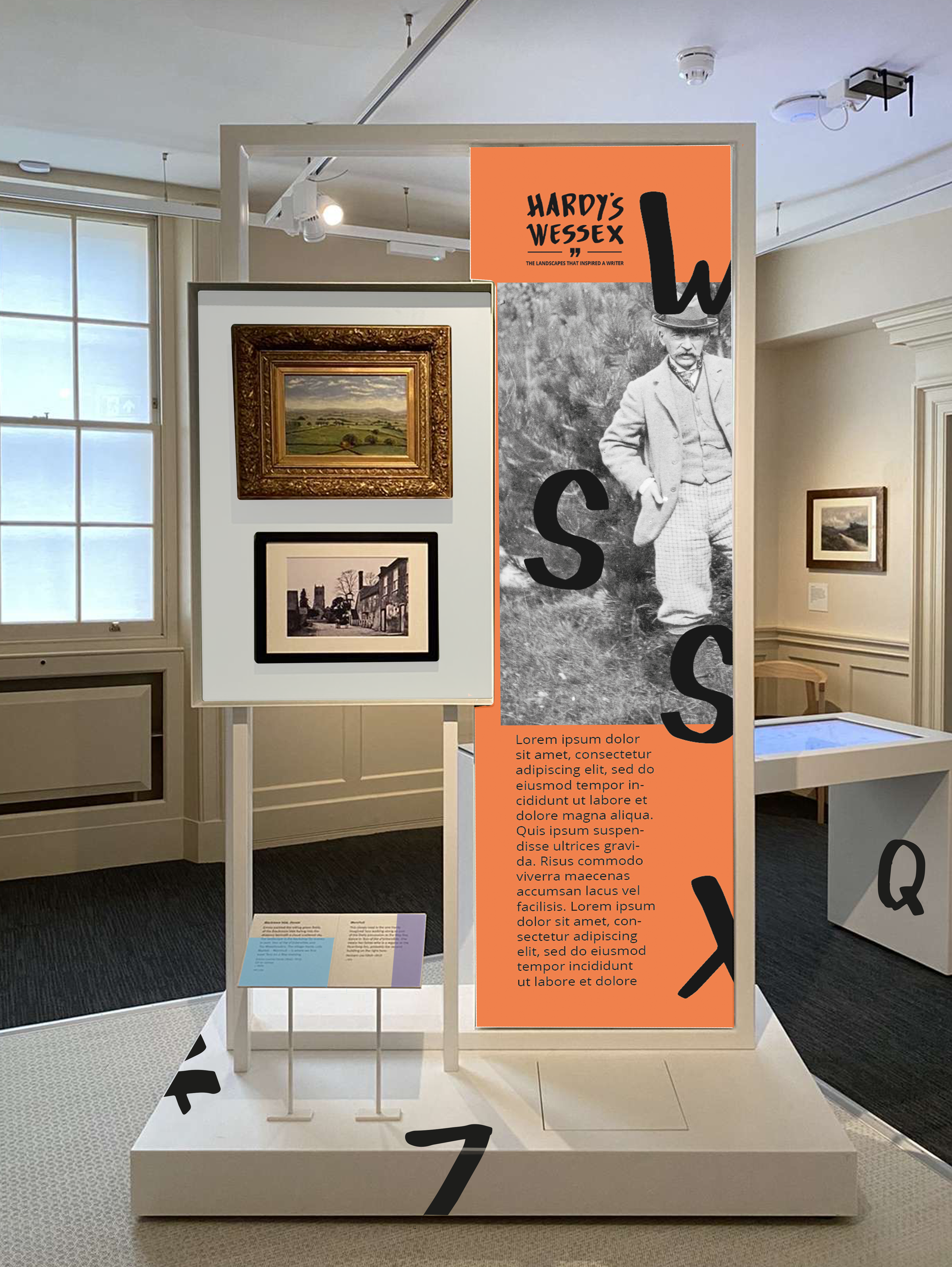
The outcome of the project should be a holistic brand and touchpoints to reflect Hardy’s life and the reasoning why this exhibition came to exist. The touchpoints asked of by the clients could be anything from external promotions like billboards or bus stop posters, to internal informational banners, to merchandise or even the social media promotion.
My Team: Kristian Keane-Munday, Ellie Bullett and Dan Smart.
// Research
Primary: Our initial investigation at Dorset Museum allowed us to realise the current branding and style was very pale, clean, and clear to the viewers. White walls and black text allowed the content to be accessible to many, even those with slight or major visual impairment. When noticing the fact there wasn’t much expressiveness and busy designs, we felt this would be a good point to refer to.
Secondary: Relating to the Graphic Design side of branding, we received an industry insight talk from Matt and Synthia at Bond & Coyne who discussed their company’s process when working with clients and the areas you should consider when making a unique and bespoke brand. After going through many examples of clients they had, they showed one client called The Voices Foundation which was a charity relating to singing and helping transform education through music. They said that they came up with the 3 concepts shown on screen however the clients said they preferred the left design but overall would like a different approach. The group took this set back on the chin and went back to the drawing board to conceptualise a new route and approach to the same idea.
// Process
Initial Ideas: To start the creative process, I came up with three unique ideas with all different backgrounds and intentions to represent the branding of Hardy’s Wessex. My first Idea was derived from the traditional designs that are currently out on the market already. My second idea is based off topological lines on a map that represent height and depth within the landscape. And for my third idea I wanted to come up with something quite out of the ordinary and break the current market trends of museum branding.
Brand Truth: When creating a brand truth, we realized that the way we perceived Thomas Hardy was more than just a talented poet and writer – we saw him for his ideas to challenge the status quote. His social activism is what connected with us most and such we wanted to highlight these facts to the many who already know him as a local writer. All in all, we perceived Thomas Hardy as “creative giant”.
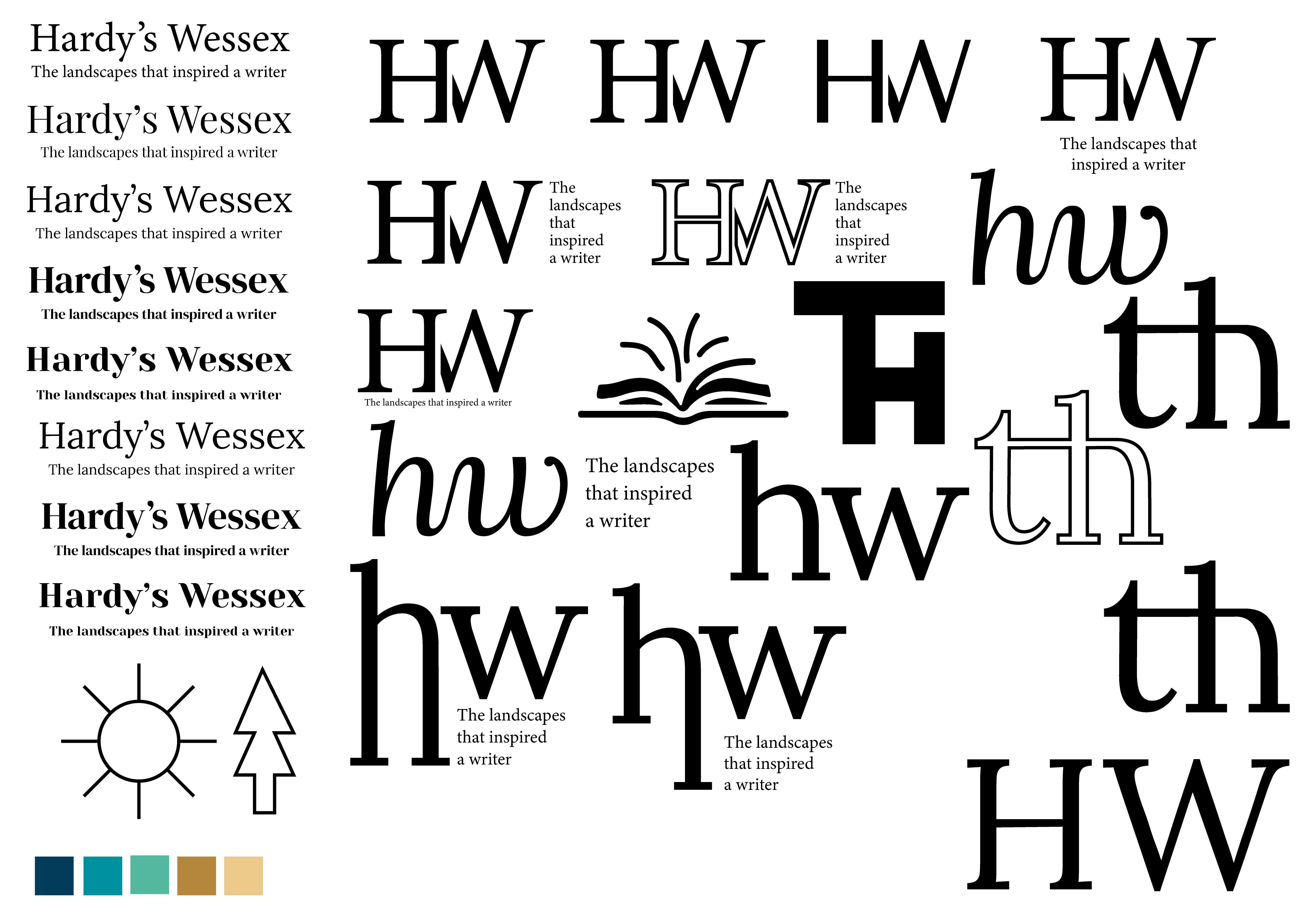
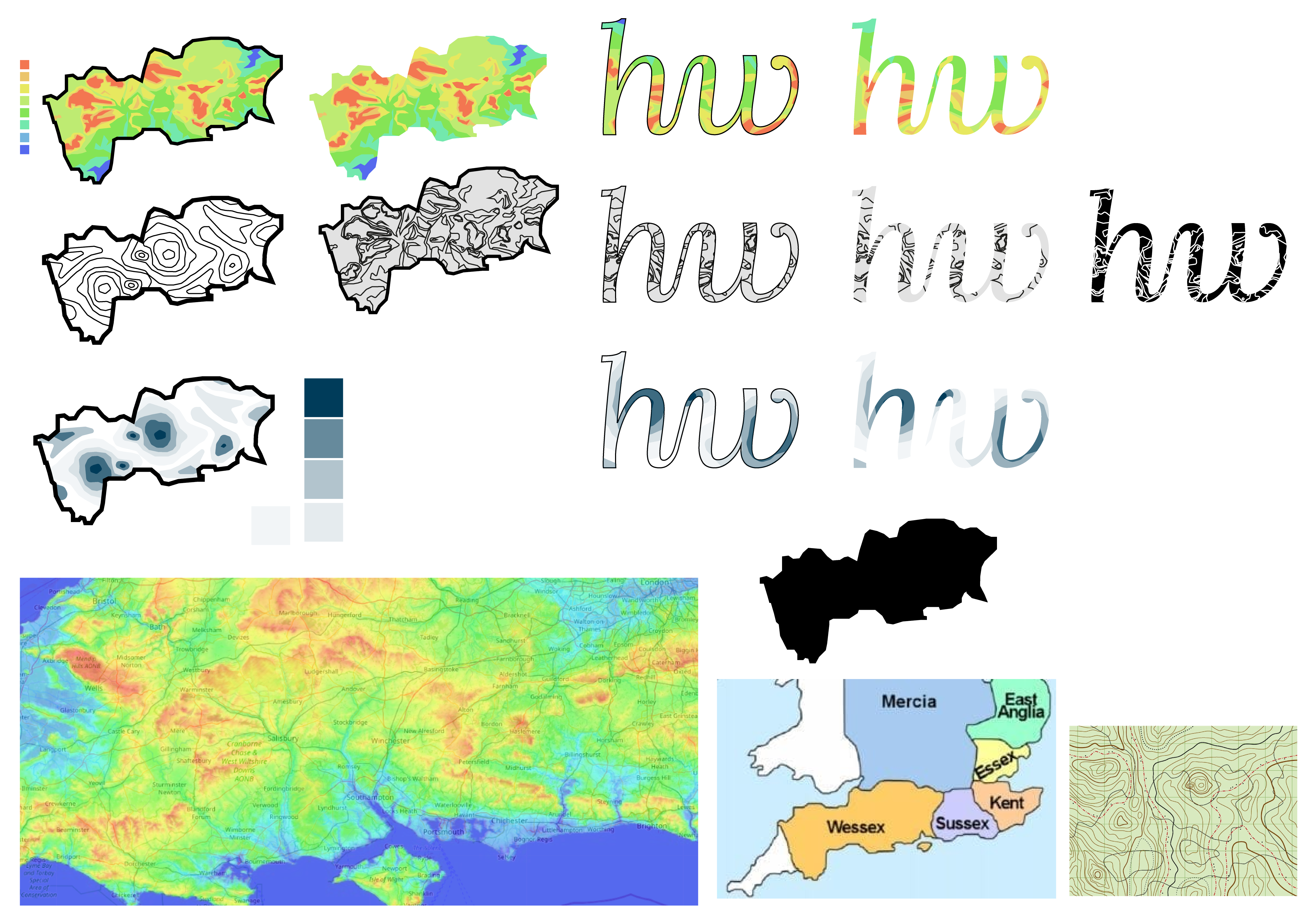
Logo Development: Developing the logo went from using a font as the basis of the logo to using handwritten letters to form a more personal and relatable brand style. We went through multiple iterations of font however decided that the handwritten was the most fitted.
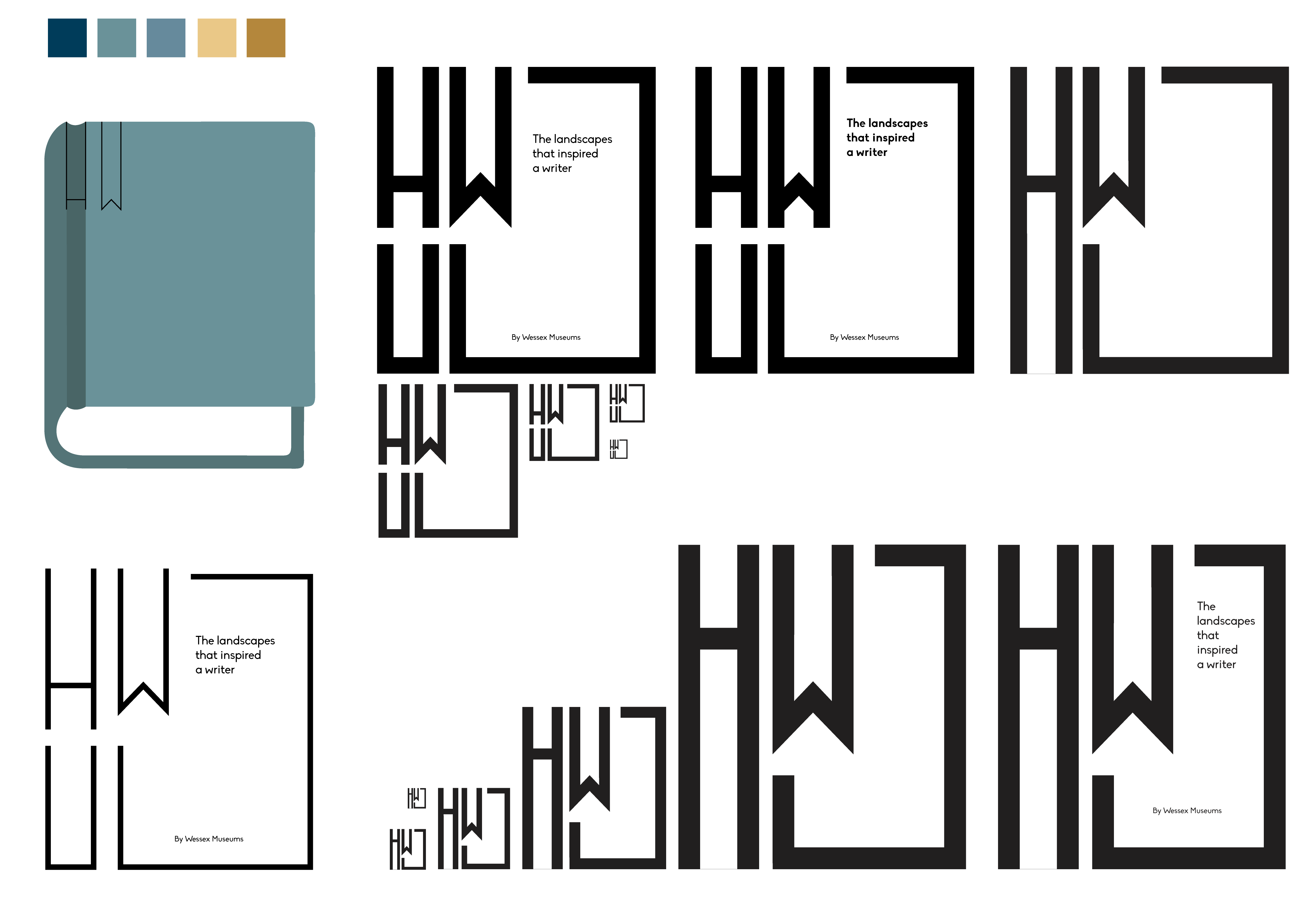
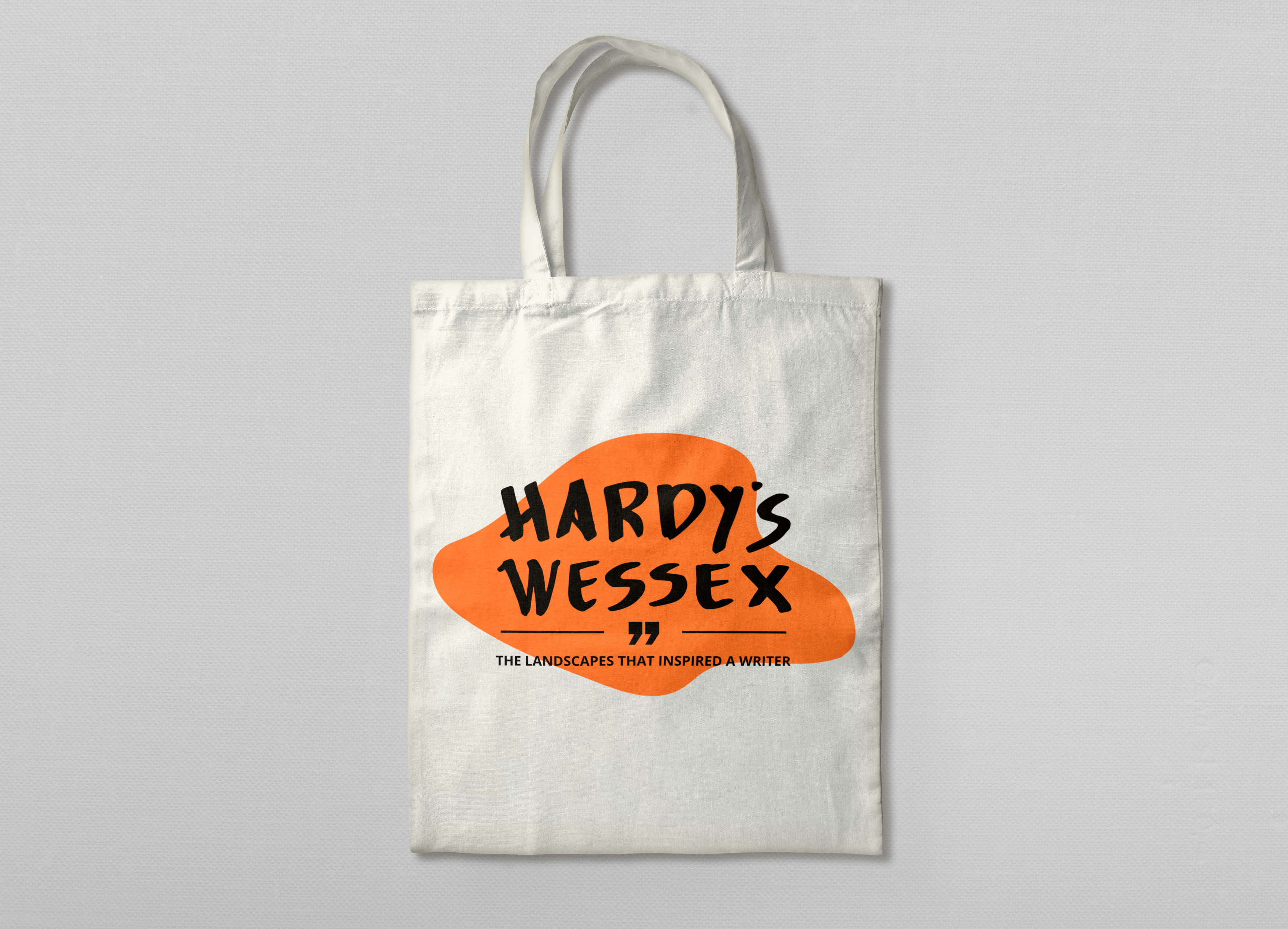
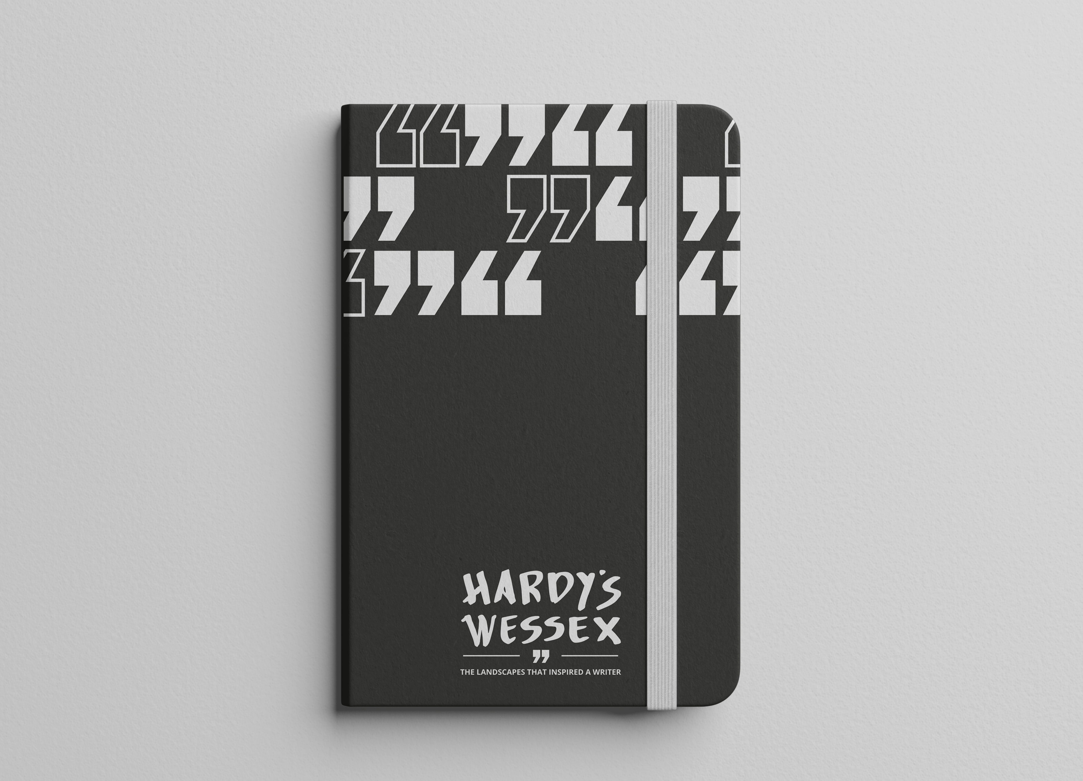
Merchandise: Another area of the project that I developed was some merchandise touchpoints. Merchandise is a way for viewers of an exhibition/museum to take home a memory of the work they saw. In most museums that have a traditional line of products that sell well and is sold in many museums such as: diaries, notebooks, stationary, prints and posters and other simple trinkets that will be framed or used. Most of these products would be applicable to represent a write however to bring a youthful audience to contributing to the exhibition, a new line of merchandise should be sold relevant to the younger needs.
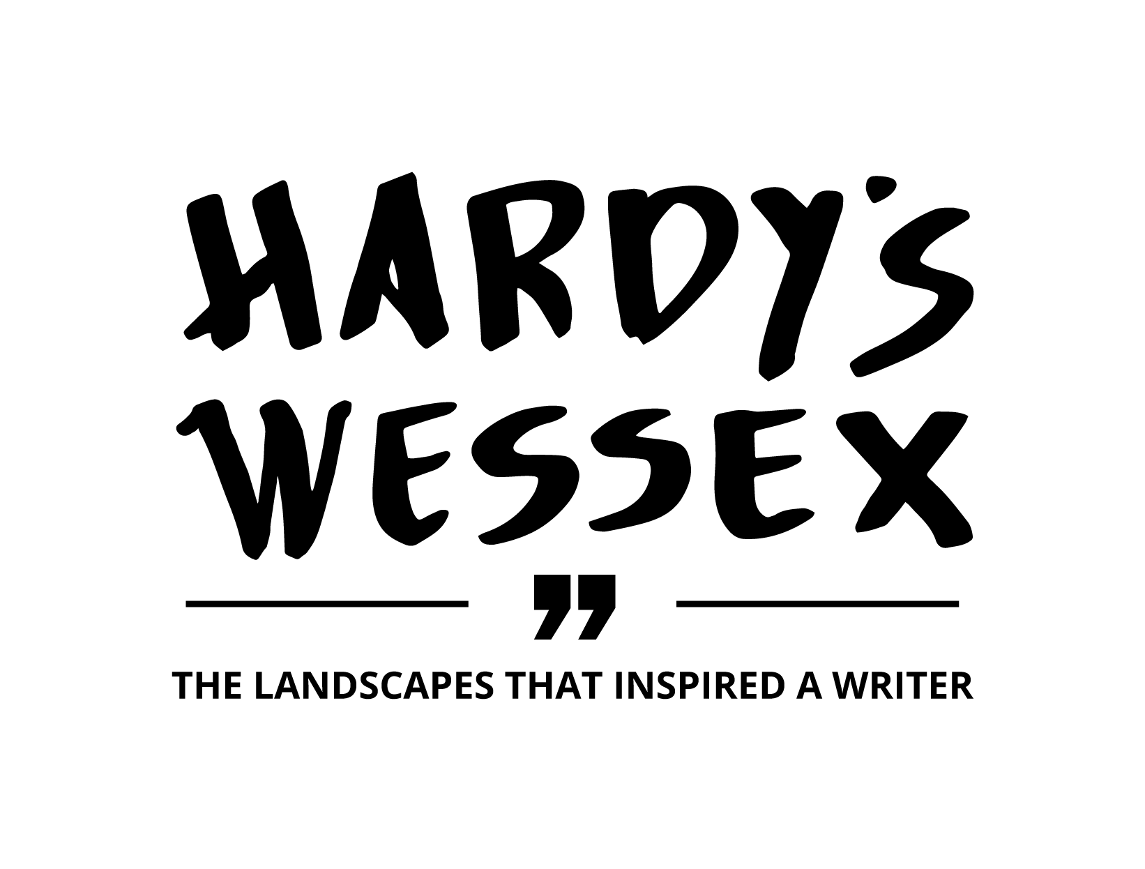
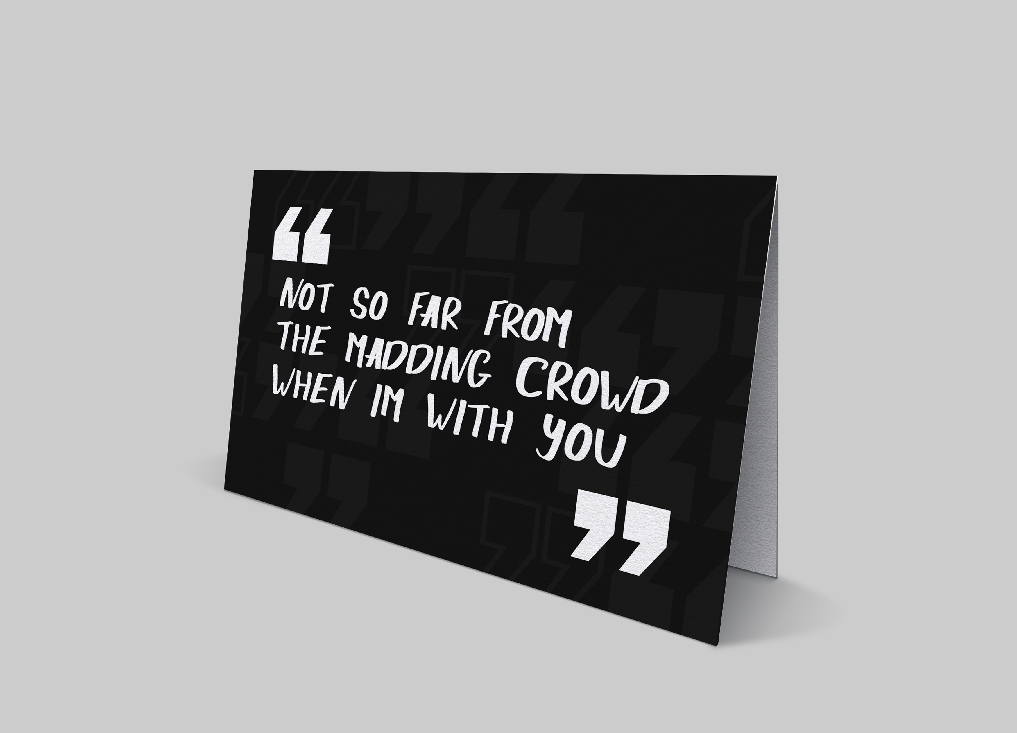
Brand Guidelines: The brand guidelines were a key point in our design process as it allowed all of our works to follow a basic rule set, and such makes each product have a recurring style. The guidelines inform basic limitation like how to use the logo and when to use specific versions of them, the specified colour palette and the typefaces we used throughout the whole process.
Final Presentation: To finalise the project, we did a group 5-minute presentation to showcase the designs and reasoning behind them. This was the last instance of contact with the client and the last chance we could hear some very last-minute feedback.
// Outcome
As a quick reflection, I believe that the project truly does represent the exhibition we were tasked with branding, and I feel like we’ve achieved the goal of enticing a new era of customers but keeping our designs simplified to not alienate the old audience that are already pre-established fans of Hardy’s work.
If you want a deeper look into the creative journey when designing the branding for Hardy's Wessex, check out my process book here!
// Evaluation
Undergoing my first live brief for branding, set by Wessex Museums, was a wonderful experience to learn professional practice and teamworking skills. From the start of the project to the end, I was overly optimistic about the brief and what was asked of me, not feeling out of the loop at any point. Feeling like they needed an innovative approach to enticing a younger audience, Wessex Museums asked us to design a brand for the new exhibition that would reflect their context of Thomas Hardy and his work, but at the same time use a modernised approach to help attract a new market of viewers whist keeping their current audience
Conversing with a client was an entirely new concept to me however it was not a barrier and that designing under conditions set by someone else was great to understanding different graphical styles to fit into different contexts. Understanding that when designing there is no room for an ego, it becomes a lot easier to design with an open mind and achieve the necessary outcome. I believe that we achieved the clients ask of creating a brand that represented Thomas Hardy for being more than just a writer whilst creating visuals that would appeal to a younger mark alongside their existing older market.
The biggest achievement I felt that the team and myself achieved was creating a brand that works in unison, each creating different touchpoints and then when sat alongside each other piece looks like it could’ve been designed by one individual. I feel like if we had more time, we could develop the logo into more of an icon rather than having it letter based, however as it is works well and stands for the brand.