Website Development
Coding
// Brief
In hopes of reflecting my own work and group collaborations, I am making a website portfolio which I will create myself out of CSS and HTML. The creation of my portfolio will allow me to present to future employers and collect my projects in one place.
// Research
When investigating some previous student sites and design agencies site, it gives me a good idea on how the pages flow and how navigations work. The common structure consists of a project page, contact page, about them/me page and a miscellaneous page for any additional projects or playful experimental projects. When diving into Pearlfisher’s site, you can divide each link to a new page and the massive web they have for a business site. Granted my site wouldn’t be this extensive but understanding the information structure is very helpful to developing my pages and links from one another.
Before developing my website, I needed to figure out some of the fundamentals on who would be viewing my site, why are they on my site, and what do I want to achieve by having my site live. The answerers to these points are: graphic designers or future employers, I feel they’d be on my site to investigate and analyse my work, and finally to use my work as a platform to gain an internship, work experience or even a job in the long term.
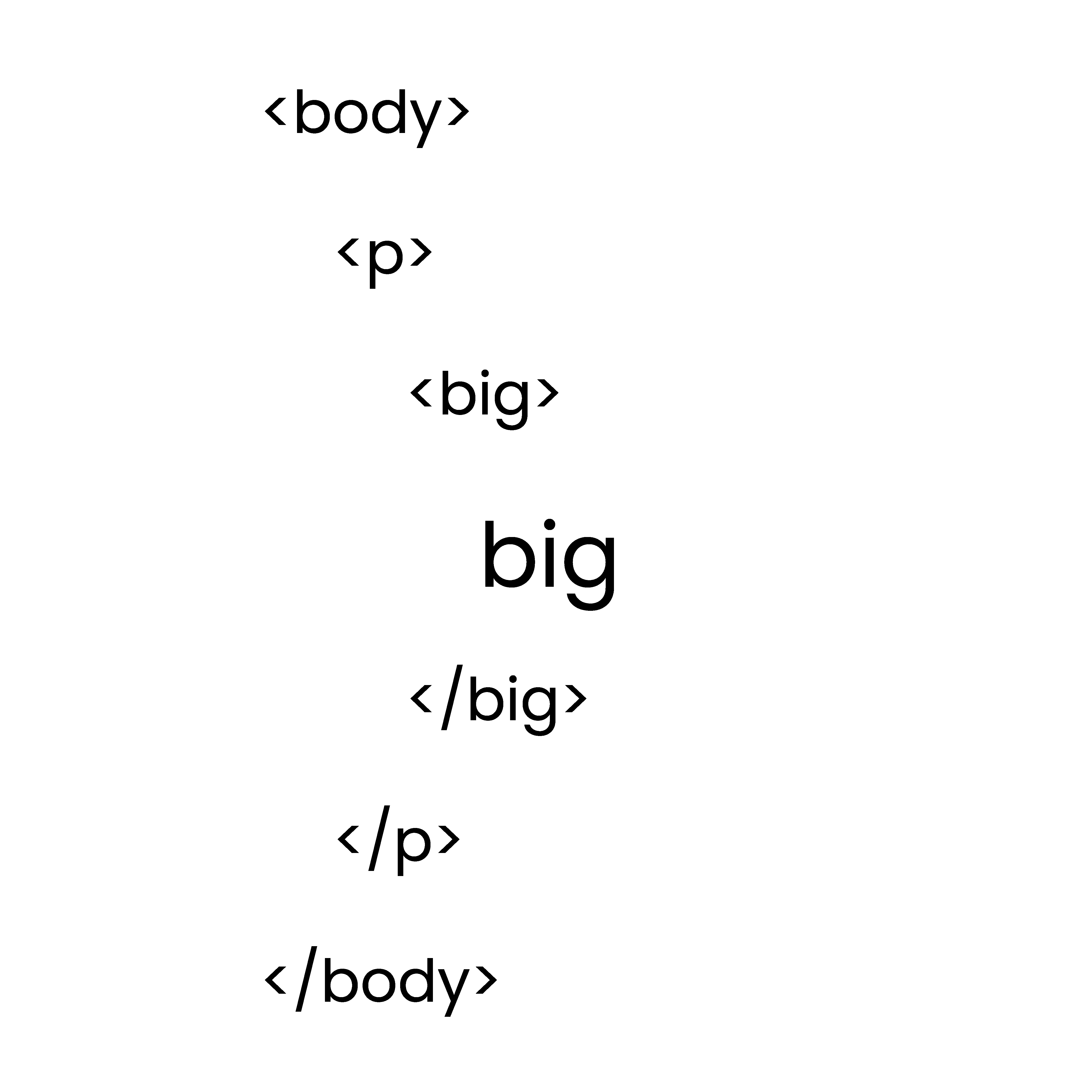
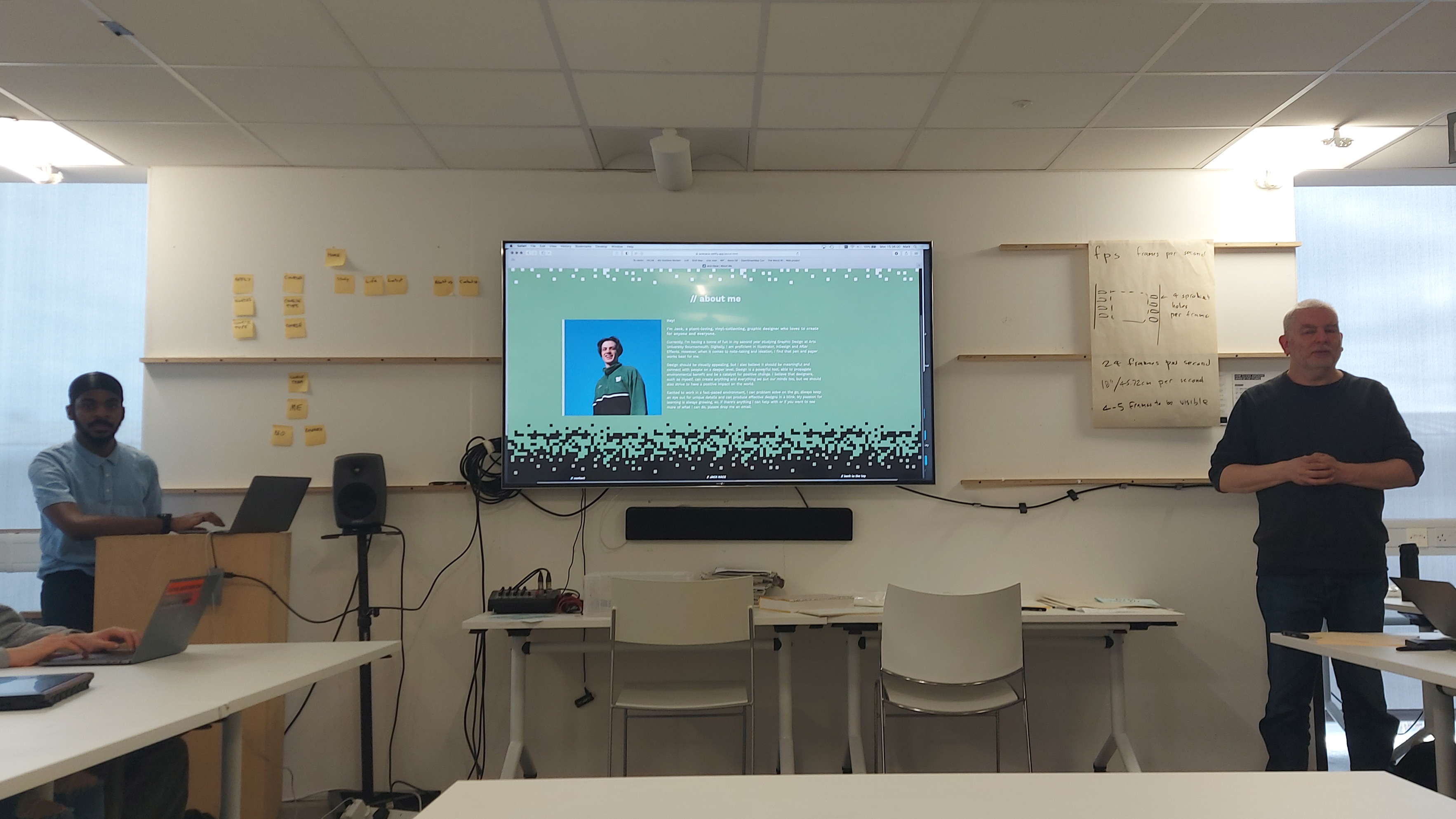
Along with the background of my audience, I needed to understand some starer terms of coding and how that it can help with the structure of my site. As shown, there are some basic text terms and paragraph structures to follow.
// Process
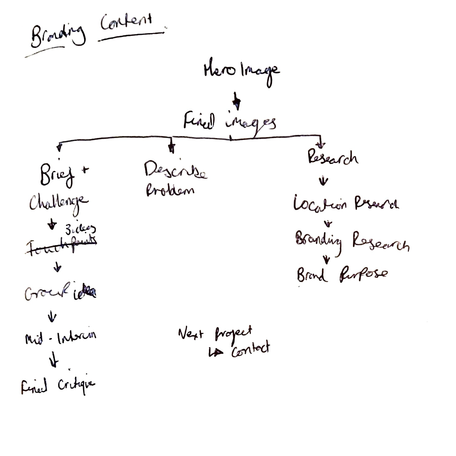
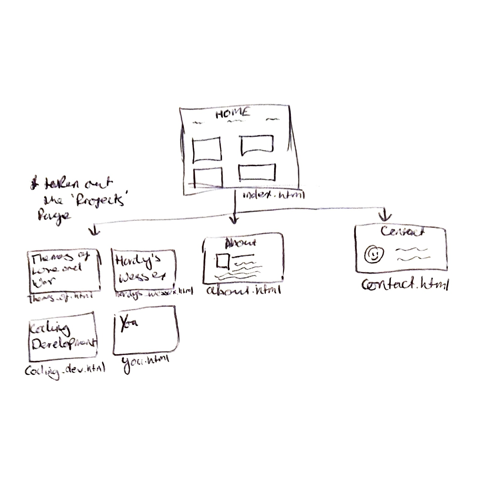
Content: Starting the stages of my website by collecting my content, I had to decide on my projects and pages that I wanted to start with to develop later. I chose to include, my home page, my branding project for Wessex Museum’s, this website development, my zine project, and the motion graphics accompanied with an about me page to describe myself, personality, and the ethos behind my design process plus a contact page containing my email and any other relevant form of communication for designers to reach me.
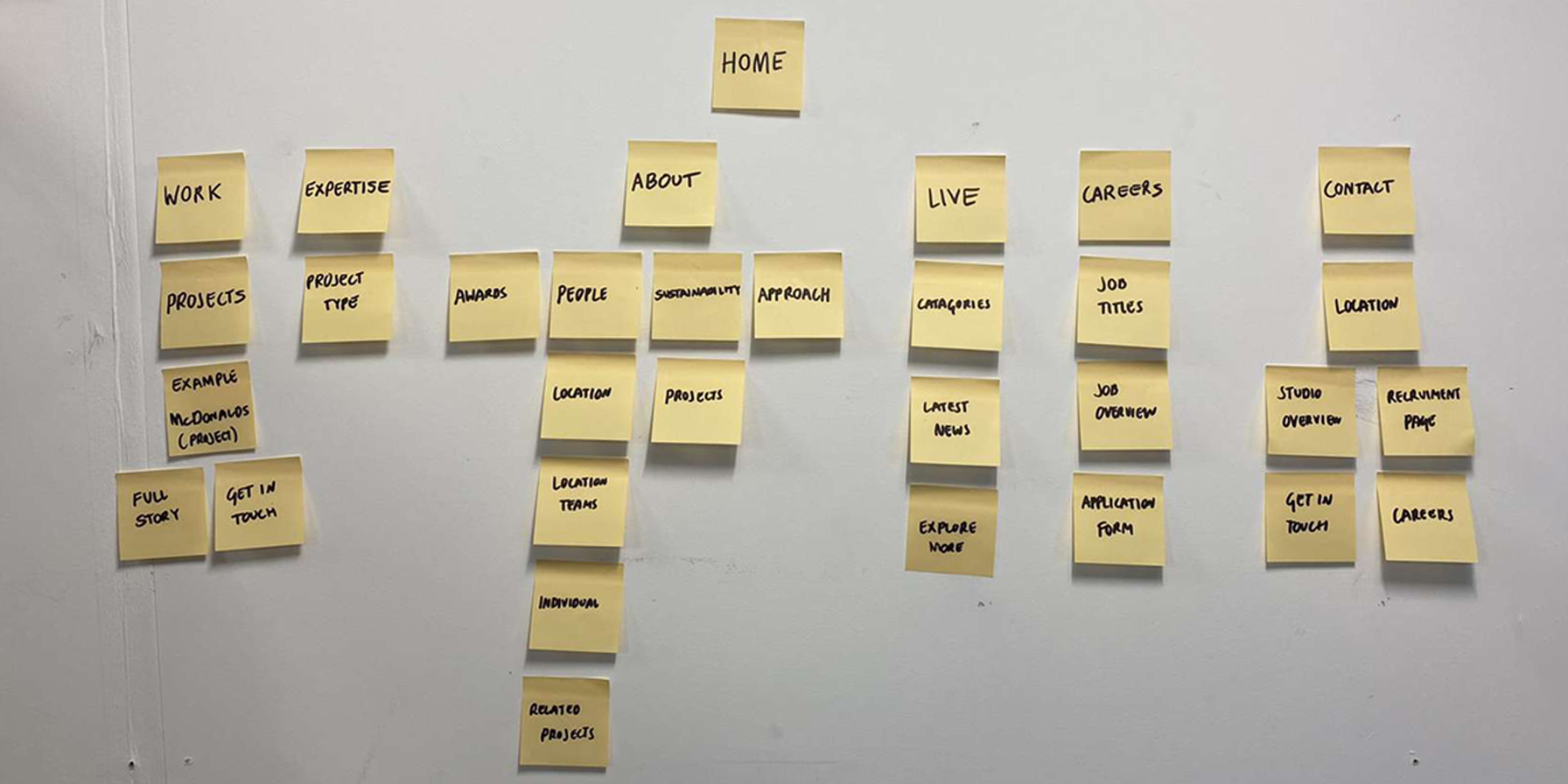
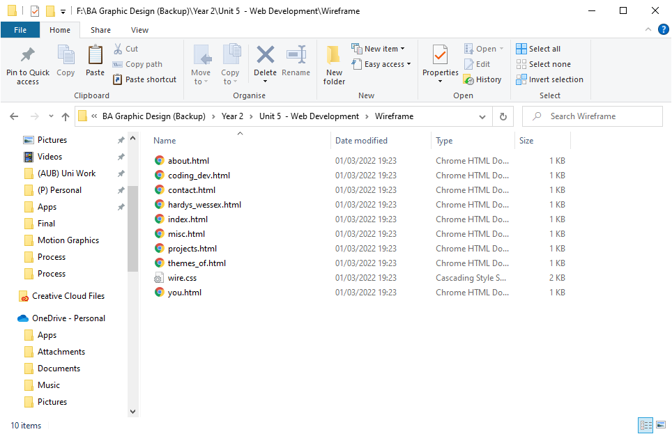
Wireframe: After understanding the content, I need and collected the images and body text in another location, I tried making a basic wireframe template of the website to allow me to test the navigation feature of my website. This means I could investigate any meaningless pages, any navigational issues and if I feel I need more content within my site.
Layouts: After the wireframe was in place, I started with developing initial layouts on illustrator. Creating these layouts allowed me to visualise how the content would need to be sectioned off and framed within the code. Along with sections, the layouts visualise columns, content, and colour ways within my website.
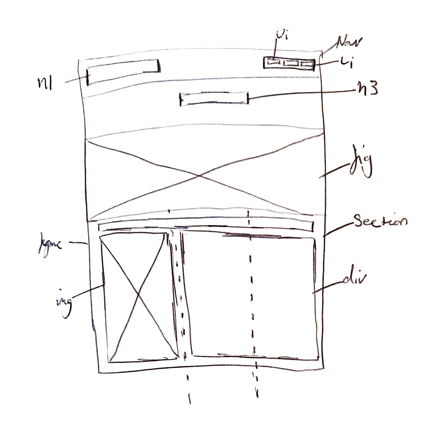
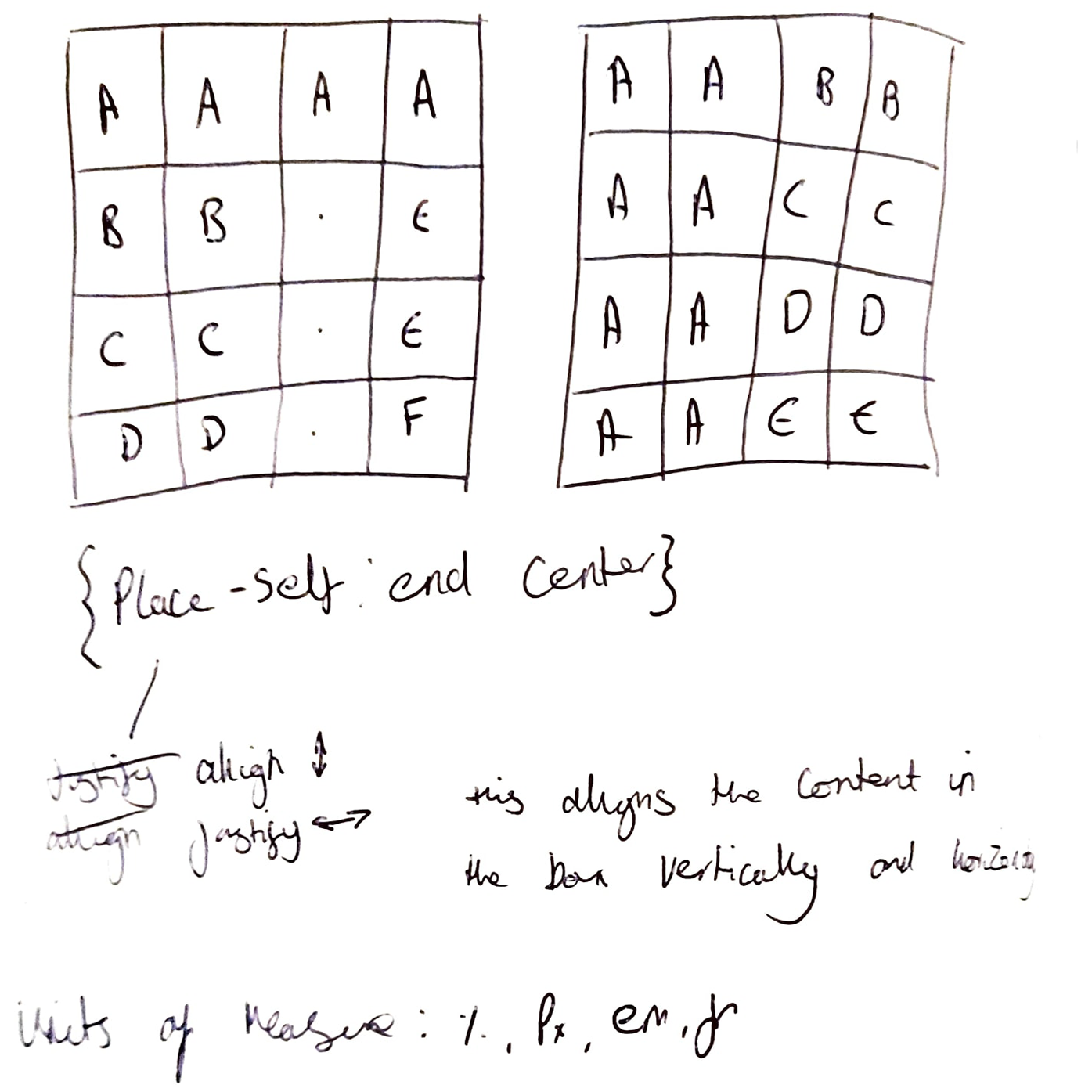
Grid: One of the biggest challenges in the development process was creating the grid to align all the content within the body of the website. Learning how to set up the grid was a learning curve as you had to visualise how the grid would need gaps between grid cells, and then had to understand the positioning and naming conventions of each cell/formula.
Placement: Understanding the framework of the code is the first stage of designing the visuals. Once I understood many of the necessities to make a website work, I started designing, aligning frames and content in the style that best represented me.
Site Characteristics: For my site I decided to use a clear, clean, and rounded san-serif font which I was very familiar with already – Work Sans. This would be used in different weights for headers, sub-headers, captions, and body text. Accompanying this I would be using a minimal colour palette consisting of 4 colours based off the main index page image – red, green, blue, and yellow, alongside the standard white and off-black.
User Testing: Before finishing my web portfolio, I felt it was needed to gain some peer opinions on my website in its current state which was enough to gain comments on the aesthetic, navigation, and overall feel of my site. When allowing other classmates to play around on my site and investigating my content, they made some valid points that I should buff out my footer, try experimenting wit some different layouts on my explanations of each project and also how to realign some images that went askew.
// Outcome
Have a look at my final design here!
// Evaluation
Coding always interested me, so coding my own portfolio was a massive achievement for myself as I managed to learn the essentials of code which allowed me to expand my basic existing knowledge and then grow it to a place where my entire work portfolio is available to the public. Throughout much of the learning process, I didn’t find it hard understanding the meanings and use case of the code however when it got to a point when there’s large amounts of target-ers in a stylesheet, it slowed me down and would take me longer to identify where existing target keywords were located. Applying CSS to HTML was also a relatively simple task however some language translation issues arose which confused me initially, eg h1.secondary in CSS would need to be identified as h1 class=”secondary”.
In future I wish to develop my website further so that it will include more scripts and other code like java too. I vision to include more work that I would’ve created throughout the next year at university, and more personal projects to express a range of designs and ideas that may not have any contextual relation within a brief. To make my site more interactive and keep users there I had an idea to develop a password-protected section that users can gain access to via finding clues throughout the site.
Overall, I feel that I have successfully achieved a website of high quality that does everything that I’d need to help express my work in a positive light and have an asset to help present to others my work and creative process.